
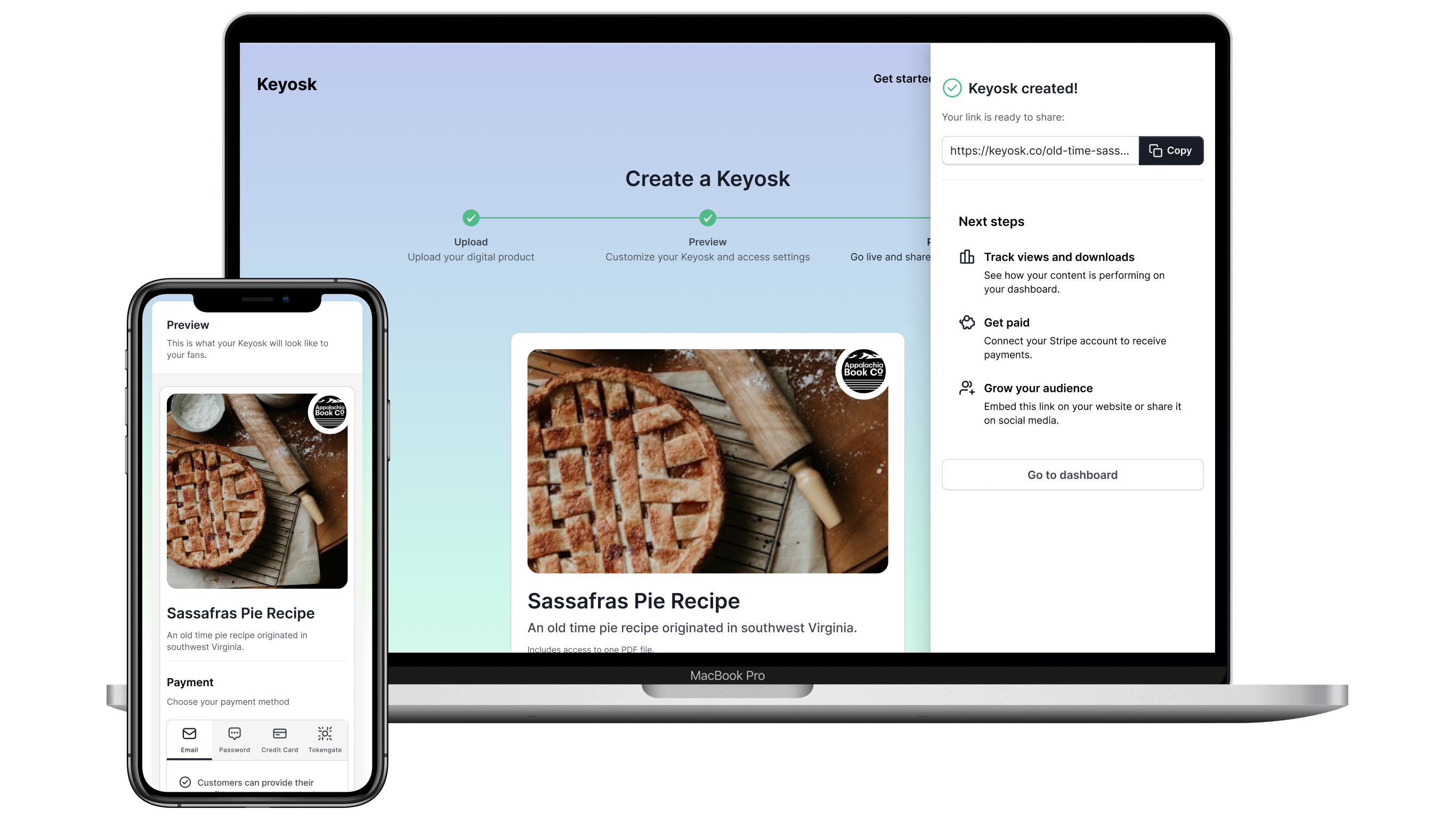
I was the sole designer on Keyosk, a product for creators selling single pieces of content through a simple link. I owned strategy, UX, copy, and prototypes. I narrowed six competitors to one defensible idea, cut the creator flow from seven steps to three, designed it in Figma for desktop and mobile, tested it, and when the launch drew no users, led the research that helped the team close the project before investing further.
Tools: Figma, Notion, Claude
The product owner wanted to rework an existing file-sharing flow into a simple, a la carte tool for creators: sell one item through one link, with various checkout options.
Before designing anything, I analyzed six competing platforms, including Gumroad and WeTransfer. The analysis killed three directions and isolated one defensible wedge: anonymous checkout. To stop scope from reopening every week, I built a Notion decision log and test protocol so every direction got a documented go, park, or kill call.

I designed the end-to-end flow in Figma for desktop and mobile: upload, file received, edit, publish, and account creation. I built prototypes for the product owner and developers, and wrote all the interface copy, reviewing it with the product owner for approval.
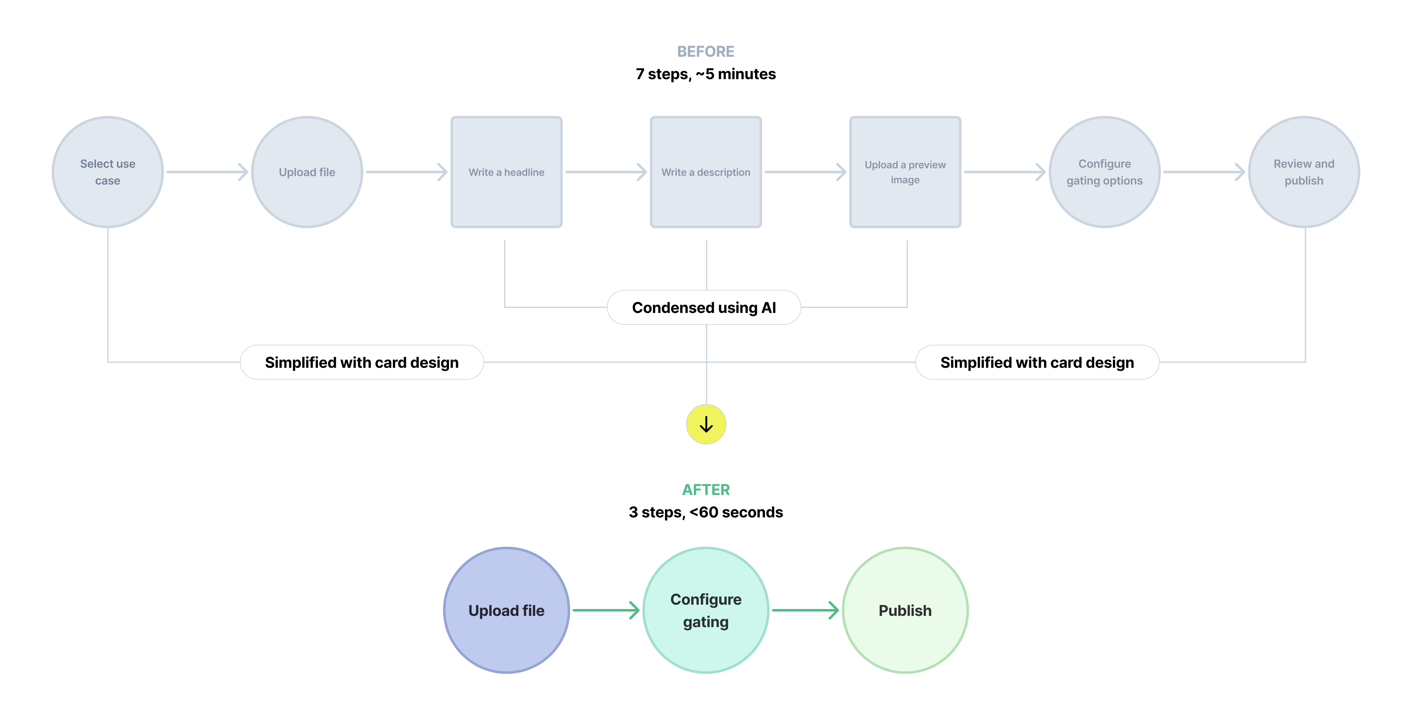
The original flow walked creators through use case, file upload, headline, description, preview image, gating configuration, and a review screen. I collapsed it to Upload → Configure gating → Publish, on a single screen with progressive disclosure.
AI-generated metadata did the heavy lifting: the uploaded file generated a title, description, and preview automatically. Creators could edit anything, but most didn't need to. Required input dropped from twelve-plus fields to two: the file and the gate.
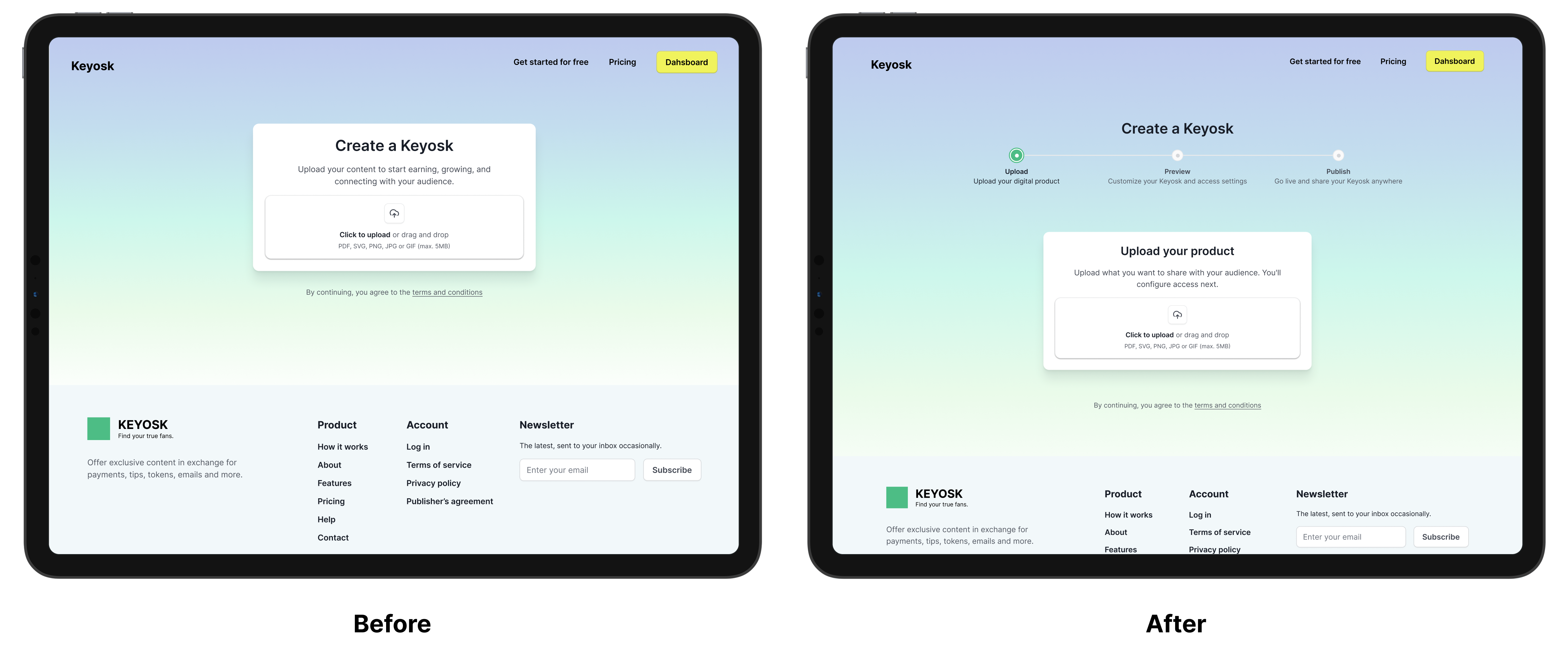
Problem: Testing showed users couldn't tell what they could do on the upload page, and many asked, "What is a Keyosk?"
Change: I replaced the vague heading with a descriptive, action-oriented headline that says what the user is creating, and added a subtle step counter to keep people oriented in the flow.
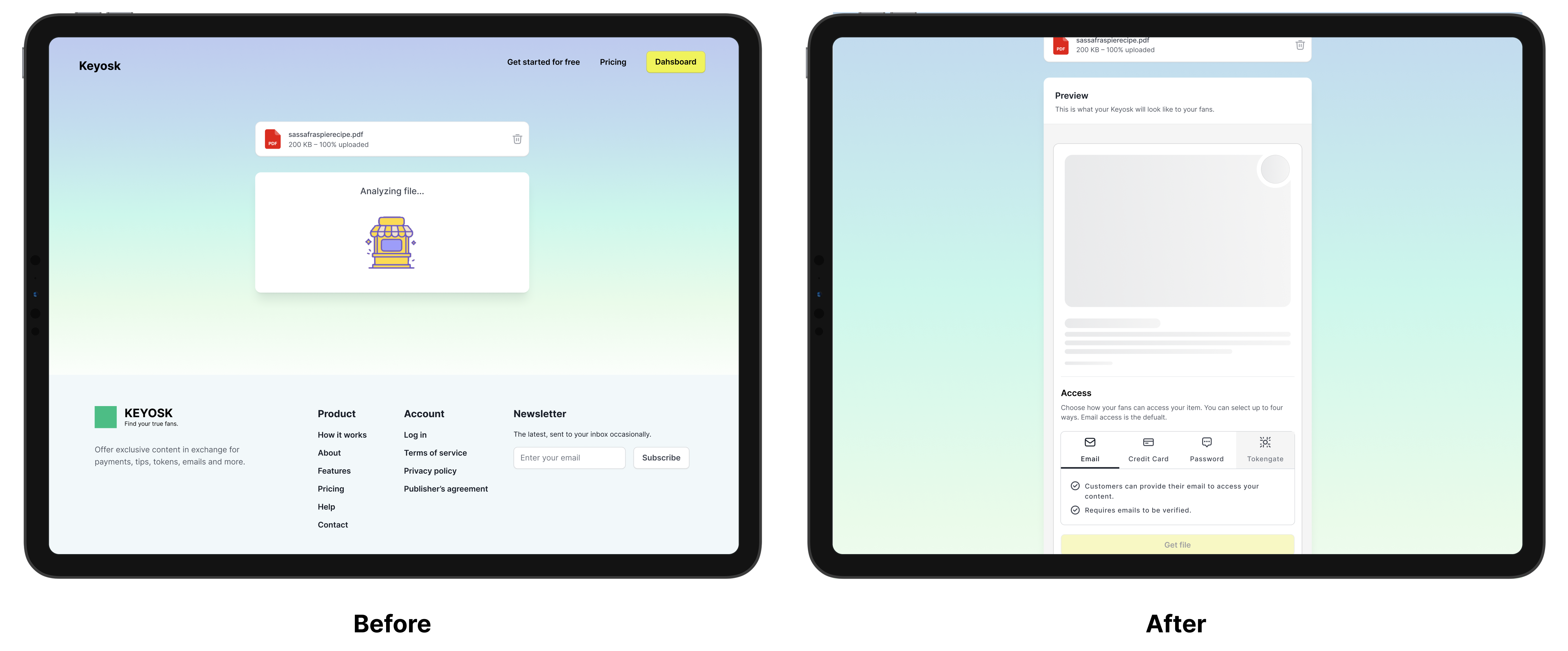
Problem: The separate loading screen was slow and gave users no feedback about what was being built.
Change: I removed it and used a skeleton loader instead, so users watch their Keyosk take shape and get immediate feedback on what they are creating.
We built and launched a working prototype, but no one used it. The problem was marketing: we didn't know how to reach creators or grow a user base.
Instead of designing more screens, I pivoted to strategy research to answer two questions: who are our users, and how do we reach them? The research concluded that the space was saturated, and that we had no niche that could compete with established platforms like Gumroad and WeTransfer. We decided to end the project.
The project closed in August 2026, with the evidence behind the decision documented. Cutting losses early was the right outcome: the team stopped investing in a product the market didn't need.
What I'd carry forward: validate demand before polishing flows, define success criteria before launch, and keep a decision log so scope doesn't reopen. I would also test distribution, not just usability, much earlier.


